
개발/Android
Server Driven UI
이도일
2023. 7. 25. 11:29
Server Driven UI
- 서버에서 제공하는 데이터를 사용해 기본 구성요소를 렌더링 할 수 있게 하는 방법
- 앱의 모든 레이아웃을 하드코딩 하는 대신, 서버에서 데이터를 가져와 런타임에 동적으로 UI를 생성함
- 네이티브 구성 요소가 앱에서 직접 렌더링되므로 로드 시간 단축, 성능 향상
Pros-in-native
- 성능 : 콘텐츠를 웹으로 로드하면 더 느림. 네이티브는 빠름~
- UX : 네이티브는 플랫폼에 최적화되었으므로 당연히 더 좋음. 전체 앱에서 일관된 모양과 느낌을 제공할 수 있음
- 보안 : 안전~ 웹은 당연히 데이터를 직접 받아서 로드하므로 보안 위협 있을 수 있음
- 접근성 : 네이티브는 장애가 있는 사용자가 텍스트 → 음성 변환 같은거 사용할 수 있도록 지원함
How to get Server-Driven-UI?
Contentful CMS
- 채널을 통해 해당 콘텐츠를 제공할 수 있는 헤드리스 콘텐츠 관리 시스템
GraphQL
- API용 쿼리 언어
Contentful CMS with GraphQL → Android
Example
- Contentful에서 ui에 대해 정의
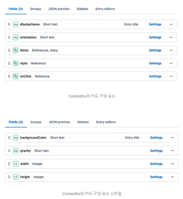
- 안드로이드에서 GraphQL로 받음
query LayoutDetails($layoutId: String!) {
    parent(id: $layoutId) {
        childrenCollection(limit:20) {
            total
            items {
                ...cardData
            }
        }
        style {
            backgroundColor
            backgroundImage
            padding
            gravity
        }
    }
}
fragment cardData on Card {
    orientation
    itemsCollection(limit:10){
        items{
            __typename
            ...textviewData
            ...imageviewData
        }
    }
    style{
        backgroundColor
        gravity
        width
        height
    }
}
fragment textviewData on Textview {
    text
    style {
        textSize
        textColor
        textStyle
        align
        gravity
        paddingTop
        paddingLeft
        paddingRight
        paddingBottom
    }
}
Example1-2
- data class를 만들고
data class CardData(
    val title: String,
    val description: String,
    val imageUrl: String,
    val backgroundColor: Color,
    val borderRadius: Dp,
    val width: Dp,
    val height: Dp
)
- 갖다 써도 됨
@Composable
fun CardComponent(cardData: CardData) {
    Surface(
        shape = RoundedCornerShape(cardData.borderRadius),
        modifier = Modifier
            .width(cardData.width)
            .height(cardData.height)
            .background(cardData.backgroundColor)
    ) {
        Column(
            modifier = Modifier
                .padding(16.dp)
        ) {
            Text(
                text = cardData.title,
                style = MaterialTheme.typography.h6
            )
            Spacer(modifier = Modifier.height(16.dp))
            Text(
                text = cardData.description,
                style = MaterialTheme.typography.body1
            )
            Spacer(modifier = Modifier.height(16.dp))
            Image(
                painter = rememberImagePainter(cardData.imageUrl),
                contentDescription = null,
                modifier = Modifier
                    .fillMaxWidth()
                    .height(200.dp)
                    .clip(RoundedCornerShape(cardData.borderRadius))
            )
        }
    }
}
- 생성은 이렇게
val cardData = CardData(
    title = "Card Title",
    description = "Card Description",
    imageUrl = "<https://example.com/image.png>",
    backgroundColor = Color.Gray,
    borderRadius = 16.dp,
    width = 200.dp,
    height = 300.dp
)

CardComponent(cardData = cardData)
Uploaded by N2T